

Curt Jerome Wild
-
Posts
7,324 -
Joined
Content Type
Forums
Store
Blogs
Downloads
Events
Gallery
Posts posted by Curt Jerome Wild
-
-
Finally having a few moments to update and check in!
Oi! It's been quite a long time and never have a second to post...
BUT here are some pictures of Princess Chaos!


Just turned 3! She is an EARTH, so check out that natural warm golden auburn hair in the sunlight!
Note that it just looks dark brown, if she is inside or in the shade.
Another reason why I tell everyone that you must see skin and hair tone in natural sunlight!;)
And...
Drumroll....................................
We have Baby CJW Number 2 due in 6 weeks!
So stay tuned!
Another of the many reasons I've been so busy I haven't posted!
:D;):cool:
-
Now, Curt recommended that I hem up the brown cocktail dress a bit. I posted a picture of that a few pages back, I think. I decided to take it to a tailor that has been around a while, but not my usual place. I figured that I'm only hemming the dress up a few inches, right? Ugh....well, it's completely fixable but I won't bring anything there again! I wasn't counting on bringing that anyway, so I'm okay with my dresses. The tailor did fine with the chiffon layer, but she didn't smooth out the satin and the lining before she hemmed it, so it lays funny. It makes the dress stick out a bit on one side. Like I said, it is fixable. I would have done it myself to begin with, but the chiffon has one of those thing, rolled hems and my basic sewing machine doesn't do those.
Lesson learned! When I get back, I will either fix it myself since the rolled hem is fine, or bring it to my favorite place.
Oh noes!
My first question is that the length/cut is as good for you as I advised in general?:confused:
Second is that it can be easily fixed in some way, as in my mind it will be so amazing and perfect on you!;)
A general idea/note is that on something like this, you can actually "iron" or just put some weights/books on the part that is not folding right to make it work temporarily.
Not for the long run, but just for a day...
(Secrets from a location set:D)
-
Hi Everyone!
I just wanted to give you all a major "heads up"!
Banana Republic has a PERFECT Earth Trench right now.
On the website it looks like a bright Fire - but in actual person it's a perfect beautiful Earth muted tone!
As soon as I saw it, I thought of all of you.
It's really nice and could be a great long term classic capsule wardrobe piece for any of you in the market for it.

Just wanted to let you all know.
It's a perfect Earth tone in actuality - the picture/tone on the website is completely off.
Check it out in person.
CyberHugs you all!
:D
-
Side Note...
Anita, when you have a moment, please check your email!
:D
-
Hey Earth Ladies!
I apologize for not "being around" for a while...
But work and life are seriously wonderfully busy!
I'm thrilled to see that you saw my post, as I was going to put a general Earth Blue Alert here - just for you all.
:D
As I said in another post, I should get some more "down time" in a month or so when summer hits...
Super happy to read that Anita got those shirts - and Anita, I think you can see now why I was so "Alert" on posting that for Earth people.
Rarely have I ever seen such good Earth Blues in a store, let alone at an inexpensive price.
;)
Got to go for now, but serious CyberHugs to all of you.
-
Hey Everyone!
Just a quick note here...
I've gotten your notes and emails...
I've been wonderfully busy, and I promise that I will try to get in here more to comment - it just still might be a while.:o
If you all agree a bit on specific questions - and want to email, that might be easier for me to post answers here.
That being said:
Member123 and Anita Latte - you two ladies are looking so amazing and fantastic!
I am so happy and proud to be a small part of your Color Intervention transformations!:)
Thank you both for sharing and keeping me updated.
It's just amazing to see you both at this point - because it's like you are finally reaching the potential that I saw in my mind's eye when we first started many months ago.
(I need a smiley face that has a happy smile with a tear of joy).
You're reaching that and going beyond on so many levels of life!
Cyber Hugs to everyone.:D
Keep going!
-
I will take pictures of some of the other clothes that I think are fire, but here are a few of me in fire clothes.
Both shirts were bought at NY and CO
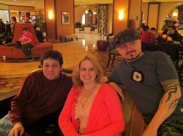
I'm wearing the same shirt in a different color. Sitting with my hubby and my friend Sam who writes horror novels
And this is my favorite sweater, also from NY& Co
Jenny!
You look absolutely beautiful in your Fire colors are warmer hair!
What an amazing evolution from where you began...
You're just totally glowing now that you've embraced "your Fire".
I'm so pleased, blessed, humbled, and honored to be a small part of your beautiful transformation!:D
You go girl!:cool:
-
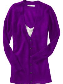
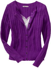
Well, the jacket came and I'm not convinced it's a FIRE purple.
What do you all think?
My dear Joby...
You are not seeing the forest through the trees!;)
Look at this:

You can't get a better Fire Purple color match to the Color Cards than you have here!
Look at how it is absolutely right and perfectly blending with the cards in bright light, low light, flash, or no flash!
That's part of the fun and beauty of the Color Cards - it's going to match and blend no matter what light you're comparing it in - the card color will match to what you need in every light.
So, you've got it. Don't overthink it.:)
Also, note to everyone - remember when I posted this long ago:

That this warm purple would be coming up in stores, and all of you Fires should take advantage and buy them up as you see them?!?!
Well, you are all seeing these warm purples in the stores now, so you can be confident that they are for you!
Take advantage now, as they won't be manufactured or available after the next season or so...
Hope this helps.:D
-
Squeeeeee!
Got all this, you all are doing so well so far!:D
-
OK, here are some pictures of some of my new clothes (including the new green dress).
Let me know what the opinions are on the colors :)
Here's a few more :)I'm wondering if the green dress is too muted. It doesn't seem as bright as the apple green on my Fire cards. Thoughts?
They all look great!
Like I said before, it's fabric - so there will always be some lighter or darker variations. Some fabric will also be brighter/shinier or muted/flat, but don't let that throw you off the color.
Your shoes are nice general brown neutrals.
Those gray slacks(?) look pretty darn good (see that was easier finding warm gray in womenswear).
The Fire Green dress looks a little muted, only because you are thinking and expecting super super bright. But, if compare that to a true khaki or olive green side by side - you will see that it's totally so bright and warm in comparison to those greens which are truly "muted".
You will definitely stand out on a cruise, as a beautiful warm bright Fire in that dress! And it's going to look stunning with your hair!:D
Make sense?
If you look at the Fire Green dress, you can see that it most definitely makes a nice Happy Color Party with all of the greens, blues, and golds on your cards!
Does that help, and feel like you're starting to "get it" a tiny bit more?
All the rest of the clothes look perfect!
Good job!

-
I took a picture of my color cards to show what I'm talking about with the dark brown shade. I placed the black strap over it for comparison:

The photo was taken outdoors in sunlight and is an accurate representation of what the dark brown looks like IRL. To my eye, it looks black, but maybe my perception is skewed. Is that not what everyone else's cards look like?
Princess422,my color cards don't have a navy that's almost black. My brown doesn't sound like yours either.
You Fire ladies are too funny here!
After all of my FAQs, I guess I need to start drawing up some "Guidelines" as well!;)
Guideline #1 - Don't Obsessive Compulsive Disorder over the colors!
Read all of my FAQs above, and this will start to make sense.
Relax. Breathe. Take it easy. These are your "control systems". Just look to create a Happy Warm Fire Color Party with your wardrobe.
It will work better if you all just take a step back, "unfocus" your eyes and minds a bit - and just look at the all around BIG picture, instead of the specific clothing item or color chip.
Focus on the Forest as a whole, and don't obsess over one specific tree within that forest.
Guideline #2 - You are all Fires, and have the same Happy Warm Fire Color Palette, but you are all not created 100% exactly equal.
Here in Cruise Critic World, you are the only ones that are comparing and contrasting your own specific Color Cards.
You all have the same Happy Fire Family, but I do personally adjust the Cards slightly for each person.
Joby and Anita's mom happen to be of similar coloring/tone, so they have more of a medium saturation Card set.
It is the best "control system" for them.
There are some people who are more mature, with Warm Dove Gray Hair that they are not ever going to color - and so it's better for them to have a Fire Color Card set that is a lighter saturation.
Princess, has a Fire Color Card set with a deeper Warm Fire Saturation, because that is the best "control system" for her specifically!
The Chocolate Brown is more of a Dark Chocolate Brown on her cards for example, because that is the best baseline in comparison to the other brown/gold/ivory neutrals on the first page of her Cards.
There is a specific personal purpose for everyone.:)
Again, read through the FAQs above, and you will realize that you all have the same Happy Warm Fire Color Party going on...
There are just some people that will benefit in the long run from having a lighter or deeper baseline as their personal control system.
That being said, that is the only color I am having trouble with on the cards. I thought the gray looked silver and not warm at all, until I held it up to the grays in my closet - then I see the difference. The whole thing is still sort of mind-blowing to me.Yes, at that's a perfect example of the point.
It takes a while to really learn your own colors/tones - as that is where you have the baseline on your Color Cards.
Take a look at the posts above on my own hard to find Warm Dove Gray Suit.
It can all be a bit "mind blowing" as you say - but hang in there all of you!
As you learn, and adjust your eyes, perception and thinking, it will get easier and more apparent.
You'll start seeing people and color and tones all over the place in a whole new way!
Keep an open mind, relax into it all a bit more - and most of all have fun
with your mind learning the process! :D
-
CJW,
so glad to read your posts!!!
CyberHugs!
You're still in a beginning learning curve here, so it makes perfect sense to me. Like I said in the above posts - for the past few seasons, various forms/tones of Warm Coral have been in the stores, so that's one of the reasons that particular shade/tone has been easier for you to see and find.Speaking of the warm violets for Fire--could you give any real life examples? Maybe a shirt or something that you have seen and know is the correct Fire violet that we could go to an actual store and see it?I need to see these colors in real life to get a feel for them I think. Does that make sense?
I'm not sure when I'll be in the stores researching next, but in general if you and the others give me some stores that are in most malls across America - then I'll check those out for you specifically next time I'm doing my rounds.
That being said...
My wife is an ICE, and I was just in the stores finding some cute, but comfortable ICE Toned Cotton Tops for her for our 2nd Anniversary (She loves that I know her colors and can shop for her, and also "Cotton" is the traditional 2nd Anniversary gift - so I thought I'd combine the two for her gift this year)...
So, I was really looking for ICE tones, but in the back of my mind - I know that I saw some Warm Fire Violets in Old Navy and Express...
(I probably saw some in Macy's and Nordstrom's as well, but I don't have as specific of a direction/memory for you there)...
Here's my train of thought for you on this...
First look at one of my own Warm Fire Violet shirts, in several different lighting situations - along side the Fire Color Cards as the "control system":

It's the same shirt, and the same cards - but you can see in fluorescent light, bright sunlight, and natural indoor light - the Warm Violet shirt blends/harmonizes with the Warm Violet Color Card/Chip.
Yes?
So, then moving on...
Take your Color Cards to the store, to use it as your Warm Violet Fire Color Control System...
Here are the ones from the back of my memory that I "think" were good or close:
Old Navy -
Express -
See how all of these are blending and harmonizing with the Warm Fire Violets next to each other on the Cards?
That should get you started on Warm Fire Violet!
Turquoise, Turquoise, Turquoise!The blues are seem to be a thorn in my side and finding them and I LOVE those.You should find these all over the stores right now...
Just take your Color Cards and they should be obvious...
Start your quest for Fire Blues right there with Warm Turquoise!
Okay?
Good to know! I hope it's helpful!Thanks for the posts above--very helpful!Kim
-
Continuing on this train of thought...
For many years, I didn't have any good FIRE Green in my wardrobe.
They simply didn't make it, or manufacture it.
But, it was in my Fire Color Palette, and on my Cards.
Therefore I knew what to look for as soon as I saw it...
Finally a few years ago, it was an "in" color for menswear one single Spring/Summer!
Menswear does not get a lot of Bright Warm colors, so I knew I had to get it while it was in the stores that season...
So, because it was something I knew I wanted to add a new color/dimension to my wardrobe, and I was always open and aware to look for it, if it ever became a "color of the season"...
I bought each and every Fire Warm Green shirt that I found.
I even bought a couple of "doubles" in the shirts that were easy on the budget - this way, when the Fire Green shirts I have now get worn out, or somehow torn, dirty, stained beyond repair...
I've got some brand new duplicates that I can pull out of storage to get me through the next 5, 10 or 15 years until Warm Fire Green becomes an "in style color of the season" for menswear again!
Which brings me to the elusive Warm Dove Gray for FIREs.
It is more likely to find eventually in womenswear - but almost impossible in menswear.
In the back of my mind, I knew the color and possibility - and I always thought, I just want to find a nice, good suit in this elusive Warm Dove Gray - to add a different dimension to my FIRE Neutrals.
I might have looked to no avail for almost 10 years.
But, ONE season, a couple of years ago - when menswear suddenly decided that gray was the "new hip cool suit color" that someone somewhere, by purpose or by accident would make a Warm Dove Gray Fire Neutral suit.
I searched and kept my eyes open for about 18 months - and suddenly...
I found this one and only Calvin Klein Suit in the Warm Dove Gray!


Ahhhhhhh! (Sounds of the harps and angels singing and shining the light down on me in that store)
Finally!
But, I got it, and as you can see - it's a prefect Warm Gray Neutral suit for my nice Warm Fire Green and Blue shirts!
So, don't settle, keep your eyes open, and be patient!
They don't make all the colors and tones all the time...
But, if you know and learn what you NEED for your particular Elemental Color Palette - then you can grab it when it is finally in the stores!
Was this helpful?
Making more sense?
Getting more patient, but aware of what to look for?
Okay!
-
Okay, so let me give some specific examples for FIREs here...
(If I get enough requests from other Elements - Earth, Air, Ice, then I'll add those to my blog for you all as well).
So for the FIREs here...
These are the Colors/Tones that have been in the stores the past few months that are your best colors:

Bear in mind with this!
These are the basic color template - but each designer and manufacturer can end up with lighter, darker, brighter or muted versions of these colors/tones!
This is why you must use your Color Cards as a control system!
But, in general - you will have seen some version of this Warm Coral Tone and this Warm Turquoise Tone easily in most of the stores.
This is why it's been relatively easy to find those.
The bottom two colors (the lighter peach and the warm-ish blue) may or may not be great Fire colors in the actual final manufactured clothing in the stores.
It will all depend on that specific designer/manufacturer's specific dye-ing technique, the actual dye lot, the specific fabric that is used and whether it takes the color brighter or more muted, etc.
So, those bottom two colors are maybes, depending on the specific store, garment, or designer.
(They could end up more Earthy for the peach, and/or more Airy for the blue).
But, you won't know until you see it in person.
Moving on, starting now and through Fall and Winter to Spring, look for these:
Note that you've still got Coral - it's just a brighter Coral...
You've still got a Blue/Turquoise - it's just a deeper blue/turquoise...
(remember those tricks I told you about the so-called "Think Tank" and they already decided three years ago that the economy would start getting better now, so people will slowly want to wear brighter clothing?
So, you've got the same Coral and Turquoise, but just a deeper/brighter version moving forward).
But, now they're adding some Gold and Warm Violet!
These are also most likely great for FIREs, but could also be good for EARTHs depending on the specific designer, manufacturer, fabric, dye lot!
Are you getting it more now?
Making sense?
I will recommend to FIREs to get those Warm Violets as you find them now, as they haven't been around for years - and I'm not sure how many more seasons they will be in the stores!
I'll explain that using my FIRE Greens as an example in an upcoming post!
-
I’m desperately searching the stores, and I can’t find all of the Colors on my Cards!
Keep in mind that the Elemental Palettes on your particular Color Cards are a “control system” for you to look for a Happy Color Party with whatever is in the stores at the moment.
Let me give you a lesson about how certain colors are “in”, and why only certain colors are fabricated for the stores each season:
There is a so-called “Think Tank” that works two or three years in advance, and GUESSES what colors people will respond to for those upcoming seasons.
They do this, so that there will be plenty of time for manufacturers to create fabric color schemes, make the fabric, dye it and have it ready for the designers. Then the designers have to design, create, and manufacture the clothes.
Then the buyers and distributors have to get it into stores.
This all takes two to three years from Think Tank to the store.
How do “they” know what colors I want three years in advance? Simply put, they don’t…
They are prognosticating based on psychology, the economy, the world social situation, and a myriad of other esoteric guesses.
(For specific example, three years ago before the current administration - the economists in this "Think Tank" were explaining that because of the Junk Loans that were going on in the Mortgage Industry, there would be a downturn in the economy. So, the so called "fashion experts" in the Think Tank, thought "well, if there's going to be a downturn in the economy, then people aren't going to want to be so flamboyant in their clothing. They will want to be more subdued" - so they decided GRAY!
"People won't want to show off as much, so gray is a good subdued color"!
And that is why you see tons, and tons of gray clothing over the past few seasons.
Same thing with the subdued khakis out there now.
So, those of you who are AIRs out there, buy up all the gray now, as it's not going to be so abundant in the seasons ahead.
EARTHs should take advantage of the khaki/olive military inspired clothing out there now as well.
There will be brighter colors coming up in the next few years (yay for FIREs and ICEs, get ready), because the economy will be improving, therefore the brighter colors will be coming back to the stores.
Does this make actual/technical sense in the grand scheme or wardrobe and colors? No!
But this is the only/best way that all the designers and manufacturers know how to work together to have a cohesive color scheme in the stores at the same time. It also “forces” buyers to always buy new clothes – because there are always suddenly new colors in the stores.
Now, this is exactly why it helps to know your Elemental Palette, and use your Color Cards for a control system.
Each season there will be a few of your colors in the stores. Buy them when you see them. Don’t buy the “in style” colors, if they are not in your particular Color Palette.
Then each season, as they change and switch which colors are available – you will find another few colors in the stores that are on your Color Cards.
This way, you will build up a wardrobe that is not only complimentary to your own skin and hair tone – but also totally blending and complimentary together as a whole.
If you see your colors in a store, and you love it – buy it that season! It might not be around a couple of fashion seasons later!
-
...more in another few minutes or so...
-
What about denim/jeans?
Denim Jeans are such a staple of our wardrobe culture that your basic natural dark wash jeans are basically a Neutral for every Elemental Color Palette.
The nature of the material is that it will subtly pick up the tones of the rest of your wardrobe. If you stick with a natural normal dark wash jean – then it will essentially serve the purpose of a Navy Blue that is in everyone’s Color Cards in some way, shape, or form.
Obviously you can venture into colors that are within your own personal Color Palette – Fires should look for Camels and Chocolate Browns, Earths for Olive Khakis and Dark Browns, Ices for Black and Charcoal, and finally Airs should look for Grays and are the only palette that looks good in very faded blue jeans.
For specific Fire example, take a look at my packing for a 5 to 7 day cruise (or a trip to Vegas):

Note how everything blends into a nice Happy Fire Color Party...
Note how I have 3 different pair of jeans/denim that all blend happily with the Warm Fire Color Palette...
Note that my lighter jeans pick up the lighter warm aqua tones from the rest of the blues in my wardrobe.
Note that I have various levels of light to dark Warm Brown, I have various levels of light to dark Warm Blue, and I even have a couple of shirts with some (gasp) white on them!
Note that the white is a small subtle portion of the prints, and when combined in the overall wardrobe - the 95% Fire Warmth makes it work.
But, again, as a whole entire picture - my wardrobe is a complete Happy Color Party of Warm Bright Fire Tones!
Is this starting to make a little more sense now?;)
-
...continued in a few minutes or so...
-
This color isn’t an exact match to my Color Cards, what do I do? This color looks close, but is lighter or darker than my Color Cards, what do I do?
It’s okay. Sometimes you will find a clothing item that matched exactly, other times it may be lighter or darker.
But you are just using your Color Palette as a “control system”. You will see when a fabric blends and harmonizes with the Tones on your cards. Does it look like a Happy Color Party? Then you are good to go.
When you place the fabric next to the cards, and you can see that it doesn’t blend with everything else – then it’s not good for you to add to your wardrobe.
You will see that they stand out like a sore thumb next to your Happy Color Party. That just means that you aren’t wasting your hard earned cash on an item that you’ll end up not wearing when you get home.
Keep a harmonizing eye on using those Cards as your “control system”, and only get those items that blend happily.
Here are some various blues:

yellows:

and gold/browns:

That all make a Happy Fire Color Party with the Color Cards as a "control system".
Note that they can be lighter, or darker (note how much darker my brown shirt is...) - but they still blend and harmonize as a whole!
Look at my Fire Green shirts here:

none of them are an exact "perfect" match - but they all obviously blend, and harmonize between the Fire Greens on the Color Cards.
-
Does my Element change with age, or when my hair turns gray?
No. You are the same Elemental Color Palette from a baby, through childhood, through your adult life. Your skin may lighten or darken, your hair may change several times throughout your lifetime – but you are still just a lighter or darker version of yourself.
You are still the same Fire, Ice, Earth, or Air at age 1 as you are at age 100!
Sometimes people think they don’t look good as they age, and that is because they aren’t sticking with their natural palette, or never started it in the first place.
You need to wear your proper Color Palette even more as you get older. It will make you look younger, healthier, and more vibrant.
Gray hair will pick up the proper tones and look brighter and more blended.
I do often suggest that people with naturally graying hair, to start wearing more of the lighter colors in their Color Palette.
Just as the darker makeup in your Element can start looking too harsh as your skin and hair lighten with age – you should be adjusting your makeup and your wardrobe to the lighter, softer colors as your main wardrobe choices. Use the darker or brighter colors as accents.
-
Does my Color Palette change with or without a tan?
No. You are just a darker or lighter version of yourself with or without a tan. Your own personal Color Palette is the absolute best for you not matter what.
When you are extremely tan, then you can “get away with” the wrong colors better – but then you’re just fighting the whole system, and your entire wardrobe trying to do that.
And most importantly, to all of those people who insist that they “need a tan” in order to look good – if you need that tan in order to look good, then you are absolutely in the wrong, wrong, wrong, color palette.
When you are in your correct Elemental Palette, then you will look glowing and healthy at your most natural non-tan self!
-
Can I be more than one Element?
No. Some people may seem to be close to the cusp of two different Elements – but with proper testing and diagnosing, one Elemental Palette will become obviously a much better Color Palette than the other.
Some people will try to “force” themselves into the wrong palette, or into mixing two different palettes – but they are sabotaging themselves by doing this.
Each set of Color Cards is put together in a specific way, so that your entire wardrobe will automatically coordinate. All of your clothes will look well, and complement each other – and most importantly compliment your own natural skin, eye, and hair tone.
Your genetics determined your Elemental Color Palette before you were born – don’t fight the system.
-
Hey Everyone!
I have some time to work and post tonight, so I've been putting together some FAQs for my blog - but I thought I'd put them here as well - as it will help and answer a lot of the questions that have been going on here with the FIREs.;)
I'm going to split these into separate individual posts, as it will make it easier to refer back to later that way.
Okay? Here we go...
-
And here's The B in contrasting complimentary prints in an homage to Mondo:

Just sending some good luck out there for him to win...
ginfers crossed


Stores that carry "FIRE" season clothing
in Cruise Fashions & Beauty
Posted
Finally having a few moments to update and check in!
Oi! It's been quite a long time and never have a second to post...
BUT here are some pictures of Princess Chaos!
Just turned 3!
And...
Drumroll....................................
We have Baby CJW Number 2 due in 6 weeks!
So stay tuned!
Another of the many reasons I've been so busy I haven't posted!
:D;):cool: