
Anita Latte
-
Posts
5,723 -
Joined
Content Type
Forums
Store
Blogs
Downloads
Events
Gallery
Posts posted by Anita Latte
-
-
There is so much conversation going on here and I missed it!!! :( LOL!
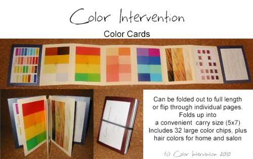
Curt, what a cool thing you do to adjust the saturation on the color cards! That is really interesting to know...and I'm so glad you joined our discussion here...I think I grabbed your one shopping trip to Express a couple pages back (because I remembered it and I know that newly interested people aren't reading all of that page-a-licious Season thread)...it's nice to hear your distinctive voice!...I know time is more limited as a Daddy. :)
Joby...you had so much fun shopping! Don't let the fabric of your green dress throw you for a loop...you did GOOD...just to restate what Curt said in general in specific...it looks like the dress fabric is more of a "matte" finish and not shiny...and I think this is why it is looking less clear and more muted in a way...when you compare the fabric to the gloss print of the cards, the fabric looks different from the cards, which can make you wonder if it's muted because it isn't shiny...but in your picture, compare the solid dress to the print...the dress can hold its own against the print...it isn't showing itself to be muted there, just a different colored green...together they blend. The green is clear, just matte clear. It really helps to group together your clothing to see how your clothes blend.
Joan...welcome to the conversation!
Terri...so you must be back from your cruise?! Are you going to make a report?
-
OOO pictures! I look forward to seeing them!
I'd have to refer to the itenerary, but I think my parents get back home on Nov 16. They are still in the Atlantic...last I heard there was only a 6 hour time difference between us...I hear from her at least every other day through email.
-
Kim...you are so complementary to me, I don't think I deserve it. But I thank you for it.
I'm entering a stage of life where I am getting more and more tired of being "safe" with things like clothing...getting over the consequences of taking more risks with my clothes and just having fun with it. I've dressed pretty conservatively my whole life...and while I still consider myself to be modest, I'm having fun with trying to play up the fun while still covering my assets... ;) What I love about the whole color analysis is that it helps to give boundaries to the whole process, which helps me tremendously...I like that bit of structure in the mix...
Have you decided on the green dress yet?
-
Joby...The key word to think about is BLEND...doesn't matter if the color is lighter or darker, so long as it is BRIGHT (not muted) and BLENDS into your color cards...you are good to go.
This is going to hold true for blue jeans for fire as well. I have been looking for true fire blue jeans for a long time now (I often shop for my Mom as I shop for myself) and I don't think it exists. Not in the traditional denim blue. In order for a fabric to be called denim, it is a specific weave of fabric (results in give/ease) and also it is a specific way of weaving the blue fabric with another color, which is why there is an undertone to denim and the wrong side of denim is very obviously the wrong side of the fabric. By the very nature of traditional denim, I don't think you can ever truly find an Ice or Fire denim in traditional blue. Traditional denim will almost always be muted.
Thus, often times, denim will have that "white" look to it, and that white on the inside...these are the Air denim. Sometimes, the stitching will even be white... Othertimes, there is that yellowy/gold (aged) look, and the stitching will also be that golden, goldenrod-like, thread...these are the EARTH denim.
Now, if you can find denim that is made with the denim fabric, but isn't died until the fabric is woven...(the wrong side will be harder to distinguish)...then you have a shot at finding denim in a fire or ice color. I think Coldwater Creek has had denim capris in colors like coral and mint and yellow...
This is one of those things where you just have to know how to work with the color palatte and bend the rules. Find a denim that reads warm and go for it. Wear your brown shoes (or accent shoes) and wear your bright, clear color close to your face.
So, Dyan, yes, the jeans are warm because of the temperature...the fade will just about put all denim in the muted category. I'm thinking that the only denim that might qualify as not muted...think brand spankin' new dark denim...like Wrangler denim...like retro Jordash or Brooke Shields in Calvin Kleins...
It IS possible to have a fabric that walks the line between seasons. The nature of the seasons will do that, because it is all based on a spectrum, so as a color approaches the dividing line, in theory you could find a fabric that would be neutral. The funny thing about a fabric like that though, generally speaking, depending on the color of course...it ends up looking great on no-one. I would put "beige" in that category. So little color there to work with in the first place...if it is a borderline thing...it isn't rich enough for earth, isn't bright enough for either Ice or Fire...and if it isn't clearly in the pink zone for Air, then Air doesn't look lovely, but just washed out as well...
With a beige suit...you really have to work it...because that will probably be a suit color that you will have to work with for a while until you really nail some great fire suits. If the color will work with a bright, tomato red shirt...and you accessorize with gold jewelry...and you wear brown shoes...and perhaps you have a fun scarf that has an accent of red in the midst of fire colors to bring your whole look together (and to perhaps get your fire color closer to your face if your shirt is not high necked)...and the beige works in multiple versions of this same scenario...trading out your fire shirts...then you have a great suit...this is what learning about the colors is all about. It isn't about having to dress by a set-rule, it is knowing how to break the rule and still look good.
For example, I am working with my clothes...I have a super fun black Chico's skirt that i have loved forever. It's an A-line skirt. It's super flattering. The material is heavy, it hangs just right...it has cream colored thread throughout to create a pattern in the black. I still have it. One outfit that I have put together recently (after the fun closet par down) is a more drapy, rayon knit muted gold turtleneck. I have a matching muted gold jacket that is a tone on tone pattern thing. I have a black corset belt (to show off my emerging curves). It's black and muted gold. Do I think it would look better with brown? Oh yes, I surely do. But the world is trained to mix and match all the colors of the seasons, especially with black, and so it works on that level. The muted gold is close to my face and the outfit looks great on me. Will I eventually replace the black skirt? Yes. But I know how to manipulate where to put color on me to "Make it work"! LOL.
Dyan (thanks for posting a name so I can stop thinking of you as princess LOL)...here's hoping your purple twinset will be FIRE!
-
I do NOT see how Borealis, Bright purple and (I could go either way on Cobalt) could be Fire. I do see that they're bright but, Borealis looks mixed not clear to me, and bright purple looks like a blue undertone.
Branch looks like it's not bright but also looks very dark chocolatey to my eye, so that' why I said Fire.
I know. I know. When I was being "diagnosed" by Curt, he really wanted to see me in Fire blue. He used the Express site to show me what Fire blue was. And Fire purple. My conclusions are based largely on my Curt education from the Express site. I am pretty confident in what I am seeing though.
At some point, muted and clear become difficult. When you start to have those colors that aren't clearly on one side of the coin or the other. But Borealis is definitely too bright to be worn by someone that needs muted coloring. WAY too bright really, so by default, it works for either fire or ice. It's definitely reading warm on my screen. Please note that they have matched it with warm jeans and not the gray colored jeans that a lot of other colors are matched with.
Bright purple does not look good with the silver of the belt buckle. It just doesn't. And when I see the "golden" color of the Amber on the screen, I can just totally picture GOLD accessories with that purple so much more than the silver. Thus, FIRE.
Cobalt. There's no doubt in my mind. It doesn't go with those gray jeans at all. AT ALL on my screen. Again, I'm actually liking it in theory with gold accessories (using the Amber square as a guide).
How the heck do you know how Talbot's does their pictures???? I am learning such fascinating things on this thread!I used to do desktop publishing for a living. I worked with Photoshop. How you know that Photoshop is being used to show the color is that the photograph doesn't change in any way except for the color changing on the clothing item being marketed. The model position is the same, background the same, etc etc.
If you look again at the Express site, you will notice that for each color that you click on, you get a brand new picture that shows the item in the color you selected. The model position changes. The pants change. It's clearly a new picture being shown. These are better to use for identification purposes, but still subject to all the faults of trying to identify colors on a computer.
-
I'll answer the pop quiz...
If I were to pick out all the FIRE colors in that shirt style, I would guess:
Bluebird
Borealis
Bright Purple
Charter
Cobalt Blue
Concord
At least on my screen. They all have that hurt your eyes kind of intensity on my screen...
By contrast, I would put these as ICE:
Classic Blue
Horizon Blue
Ink Blue
Marine
Pink Flame
Seaside Blue
Purple
Which are also intense, but reading cool, and definitely not hurting the eyes...LOL.
The Branch color? I think that it just might be a little too dark to really be a great shirt color for FIRE. I think I would look fabulous in Branch. Amber and Jungle are also me. Russian Ruby also looks like me. Komodo too.
Princess: The difficult thing about the Talbot's site is that they don't actually take pictures of the different color options. They have just Photoshopped the colors to the photograph. It is possible that the Plum Plush is a Fire color, or not. The photograph is completely unreliable because of the process.
My Mom and Dad worked very hard to get to this point in their lives. It's very inspiring!
-
Joby,
I think that dress will be a beautiful FIRE green! (If real life is represented well online, of course). I think that A-line will be very flattering. I like the neck line too; you don't need to worry about a necklace, but can have fun with earrings and bracelets.
My mom is still on the cruise. We keep in touch through emails. The last one I got from her (yesterday or the day before), they were in Spain and then a sea day. I'm not sure by memory what other ports are on the agenda before they take off across the Atlantic. Their travel plans have them on vacation for 28 days!! :cool:
Great job on all your clothing purchases! I am in the total opposite boat. I hope you don't mind my sharing on your thread...I have been trying to revamp my wardrobe ever since I discovered my lovely earth-yness. Also, trying to figure out my own personal style after years of wearing clothes fit for playgrounds and/or painting the house and other reno. Just recently, I have fallen in love with the Project Runway series (checking it out from the library and watching it a season at a time) and also LOVING Tim Gunn, who to me is the epitome of the word KIND...so I got one of his books and doing the exercise within it, I have effectively gotten rid of about 70% of my clothing. I now have an absolutely boutique looking closet with anywhere between 3 and 4 inches of space between each hanger in it.
And it's all so fabulous, I have discovered some great outfits within my own already owned clothing...one was truly inspired by Mondo (sp?) from the most reason season, being an amazing print on print ensemble that matched so well you could never have known how far apart the pieces were purchased...one being a sundress from JCPenny and the other a cardigan my Mom gave me from the Spa line at Chicos. (Mom ended up giving me a lot of her Earth toned clothing after she finally became dedicated to dressing in Fire...it helped too that she was shrinking also and the items were a bit baggy on her, while fitting me very well! LOL)
ALSO...I am steadily undergrowing my clothing...which I think I mentioned before...maybe I mentioned all of this before?:D:o Anyway, I am just retiring clothing that gets way too baggy, big and annoying. I anticipate a complete wardrobe make over before it is all said and done...
Meanwhile, I am doing what I can to make what I have work as the seasons change...using super fun tights to extend the life of skirts and sundresses into autumn. I've been seriously paying attention to my clothes for about a week now and the response from random sources has been truly a boost to the ego, fueling the fire that is already lit in enthusiasm for getting fit before the big 40 bday.
And that's what is going on with me on the fashion front...:)
-
My Mom's current LBD dress is APPLE GREEN. She says she is one of the only ones in the room that is wearing a color. And she STANDS OUT...BIG TIME!!
I think she is wearing this dress on the transatlantic that she is currently on...she can chime in when she gets back on reaction to it. I haven't been on a cruise in a long time so I don't know what other people would be thinking or what the atmosphere is like. Because of this whole color analysis and because of a personal new interest in fashion, I'm loving when people express themselves through their clothing. I appreciate the different spin people put on fashion. So I would be of a mind to appreciate someone wearing a color as opposed to another LBD. I can tell you that my Dad rarely has a hard time spotting my Mom in a crowd. LOL.
I don't think that you would look like a Christmas tree in your green dress. I think that you would likely look gorgeous (I don't recall ever seeing your photo...BUT) IF you are wearing your color and follow through with accessories and makeup, and you will be a stand out KNOCK OUT.
-

I think this looks SO wrong. That brown should not look so dark. I don't think that my Mom's cards look like this. When I look at this picture:
It doesn't seem the same at all. It's like your cards are oversaturated? Or something? IDK.
The hard thing about guessing about the blue sweater is really dealing with the whole internet, picture taking issue...when I look at the sweater, I think it could be too muted to be FIRE. When I compare the picture of the sweater to the picture of the dress that Terri posted...the sweater is much easier on the eyes...the dress almost hurts mine and sends me running for sunglasses when I really focus on it. I don't know if this is because of the texture of the sweater, throwing me off, or what, but I'm guessing no on the sweater. But this is the difficulty of internet shopping...it's all a guess until you see it IRL...Terri has ordered plenty of things that I know she has returned because they didn't deliver quite as pictured online...
Joby...those dresses are really nice...I concur with Terri's comments. Do you happen to live near an H&M store? I just read something about that in a Tim Gunn book. I tried looking online but they don't seem to offer much online shopping. Tim Gunn made them sound like a somewhat trendy store with great prices. I don't know if they have evening wear dresses or not...
Also, I wanted to point out Victoria's Secret as a potential place to get some FIRE bottoms. Sounds bizarre, I know, but I got their recent catalog (the previous residents received the catalog so now I get it...) and I saw that they have a great yellow color, called Raffia, YES, it is slightly muted...BUT I think that it could be a fabulous match for many FIRE shirts...and also they have a lovely lighter colored brown, Chocolate, and Camel. These are all in a casual pant...just wanted to share...very affordably priced...


-
I've been having a lot of fun shopping Etsy. I don't know what your budget is, but so many of the shops on Etsy either have some standard colors to choose from OR they simply say that you can pick your color.
Here's an interesting dress and shop:
http://www.etsy.com/listing/59634201/chameleon-wrap-dress-custom-made-choose?ref=cat3_gallery_16
It would be interesting to enter into "convo" with the shop owners to see if you can work with them to get the exact color you want.
I've already started thinking about what I'm going to do for my March 2012 cruise. I'm thinking about getting (or sewing myself) the reversible version of that dress so that I could have the same dress for two formal nights but look totally different. I'm really getting jazzed by the multi-use garments.
-
I guess I'm just in a total shopping mood...I'm currently planning my cruise wardrobe for 2012...LOL...I plan to sew it myself...I've been staring at Etsy for days getting inspiration for good multipurpose clothing...
Anyway, checking out Macy's again...check out this navy skirt...I think there are coordinating pants and suit coat as well...
I start looking for clues in the picture as to whether or not the color will coordinate with cool or warm. This model is wearing brown shoes and gold jewelry. Usually, I see black shoes and silver jewelry for navy...This could be a great FIRE suit. MAYBE. LOL.
The way you are describing your FIRE color cards...it sounds totally different from Mom's.:confused: But maybe the print job is just different. IDK.
How's this for help...you want your navy to be WARM and BRIGHT...:D ROFL...
Seriously though...most navy that I have found is AIR...cool and muted...the best advice I can think of for seeing if it works is to literally wear or bring a shirt you would wear with the navy...and see if it works...the more you test your eye in coordinating, the better you will get at it. It might help to contrast...grab a cool pastel and see if that looks better with the suit.
I took a look at the Talbots site (since you seem to need conservative clothes) and they have a great looking camel suit. That could be your best bet...
Joby...this could be one to watch for a good sale...there look to be two different styles of pencil skirts, a couple of pants, a couple of different jacket styles...they all look pretty classic (which they should be being Talbots) and so they should last for a good long while.
-
Oooh I want to do a transatlantic cruise.......But as for the TA cruise, Anita, your mom is doing it the right way - I've heard reviews from others who went out of the states complain that they were so busy towards the end of the cruise, and then it's over, because the relaxing sea days are at the beginning - so I guess coming from Europe and having that time to relax at the end is much better. What cruise line are you taking to the Caribbean?
This will be the second TA cruise that my parents have taken. Both have been from East to West. There is also something about the way the time changes that is supposed to be easier that way too, I think.
We are taking RC out of Galveston on Mar 11, 2012. My 40th bday is that month and after telling my parents that I wanted to do something that spring break in honor of the ocassion, Mom discovered the deal on the cruise. Pretty much everyone is banking on spring break being that week, as it's my understanding that the ship is hugely booked for being so far out. We booked a couple months ago even.
With blues and purples I am confused between warm and cool, and with browns I am confused between clear/fire and muted/earth. (Oranges, too, actually, after having seen the fire cards in person, as many of the shades really look like various shades of orange to me.) And I'm really confused about gray after looking at the other color cards. Obviously most grays and what I think of as "standard" gray is cool (like a mixing of black and white). But I have a suit that is a more yellowish gray, so I thought that was warm, but maybe kind of muted? But it doesn't look like earth has any grays (except for the gray green which to my eye looks sort of like a light olive). It does NOT look like the gray on my color card, and actually it looks warmer than that. Which leads into my other question, which is TAUPE!!! Ice has "grayish beige" which is the closest I have found to taupe, but some shades of taupe look more like a beigey-gray. Does that make any sense? And would that make a difference anyway? I think it would, because to me there is a thin but definite line between grayish (or cool) beige, and beigey (if it's a yellowish-beige) WARM gray. Am I analyzing this too much? And if I am, then perhaps Joby has wondered about the same thing? LOLColor identification will really become better with practice. If you have time, I would pop into your local JoAnn's and check out the fabric section. You'll be able to see more variety in the fabric store than you will in the stores, especially if you spend any time in the quilting section, which will be totally color coordinated. You might be able to start training your eye as to how the spectrums of the color change as they go from cool to warm. I think looking at actual fabric will be more helpful than paint swatches.
Technically, there should be a version of every color in every palatte. Technically. When you start to think about certain colors though, you can start to understand that it just may be impossible to find the EXACT thing.
Brown, for instance. If you think about painting in art in elementary school, if you end up mixing all the tempura paints together, you get some sort of shade of brown, because BROWN is one of those colors that results when you mix 3+ shades together. By the very mixed nature of brown it is something of a muted color... However, in the fashion world, you will be able to find browns that will remind you more of highly polished wood than tree bark...and these are the browns you want to find.
It is my opinion, that brown will usually be something that you want to use for basic pieces and generally, you will want to have one of your pops of FIRE by your face, because it will indeed be a RARE brown shirt that will give you the coloring you need for your skin type.
By and large, gray will be an AIR color. Because, usually gray will read cool and muted. Again, back in the art room, gray is a TINT of black, just add white, right? IRL black is the absense of color. But in the APPLIED world (monitors and screens included), black is the combination of ALL colors way over saturated, and white is the absense of color. So it is with dyes, I believe. So black, like most colors, can have many different variations and can even appear to be warmer or cooler. Like some black actually DOES look really good with gold... So it is with gray...
And since we are talking about making muddled colors...gray and brown get to be weirdly related...which is why, when you do test pictures, you usually put a gray one against a brown one. Because most grays are cool, and most browns are warm, but not always. LOL.
So, yeah, there are grays/browns that could be named either because they are so close. When I think of TAUPE, it is that brown/gray color that has a purply/pinky (mauve) undertone to it. And this to me is AIR. Like you say, you want a gray that has a more yellow undertone to it, so it reads warm. If you can manage to find the rare one that isn't all muddled looking? (an earth color)...then you have found the illusive FIRE gray. Good luck with that...;)
I'm just concerned about finding suits, I guess. Anita, I know you said a lot of fires have to live with earth-toned suits for a while and wear fire colors with them. BUT - I think there are fires who can pull off earth tones pretty well, and those who can't. And I think it's pretty clear from my test photos that I fall into the second category! I am certain that I look at least as bad in that muted gold sweater as I do in black. So I am concerned. I guess wearing a good fire color blouse is going to be key, right?Wearing the fire colored blouse IS going to be key. BIG TIME. I'm not sure what kind of suit you want...for fall/winter, I would definitely recommend getting a brown one...and just trying to find a brown that goes the best with whatever dress shirts you will be wearing...these pants are on the macy's website:
You can't see it, but they are plaid. The color of the shirt is one of the lines of the plaid in the pants. On my screen, this is a bright tomato red shirt and gold bracelets. There is another brown suit on the site shown with a yellow shirt...And the brown can stand up that particular shirt. It would seem to me that brown, even if it ended up being more of an earth brown would coordinate well enough with your FIRE colors. Be sure to wear your gold jewelry... This is why I was saying you may need to make something work for you as best you can until you can find the perfect FIRE suit.
I really think FIRE has the hardest time with the neutrals, because there really isn't a great FIRE neutral IMO. There is for the other 3 elements, but not so much for FIRE. It will take a bit of bending of the rules IMO to make certain traditional looks because it is so difficult to find the clear, bright warm navy, gray, brown for fire.
When I shop for my Mom, and I think this is what Terry ends up doing, is mixing prints and solids...then your entire outfit ends up being more of an overall FIRE look...
For your Mom and shopping...has she figured out her colors? If she does, then she might jump on the same color obsession train and then the whole shopping venture becomes more understandable...
-
Isn't that funny about vacation sometimes? It can wear you out! Member123 (my Mom) is about to start a transatlantic cruise. My parents have been in Italy since the 19th and I think the cruise starts tomorrow or the day after.
We are doing the Caribbean out of Galveston for Spring Break in 2012. The cruise line has messed up the week and they jacked up the price for the week after what is traditionally our spring break.
The idea about printing out the other color charts is a good one. My Dad (an ICE) did that. He has that kind of personality...if it isn't HIS color, he wants to know WHOSE color it is. Then he feels more confident in his color choices. The analytical, logical, everything in its place brain. Joby, from what you have written, you are so similar...:)
-
I don't know how trendy you like your shoes, or your tolerance for heels...so I tried to pick out 5 pictures that would represent a variety of shoes... Keeping in mind that these are to be dress shoes, as in work-related dress shoes, you don't want your gold shoe to look TOO dressy...these are not to be worn with a cocktail dress or formal...


There are many more gold shoes at Zappos...here is how I did the search, so you could see...
There are many more that are more gold that are beautiful, BUT they could also be cocktail dress shoes, so I didn't select those. According to Instyle magazine (something I had fun checking out that month...) GOLD is one of the fall style trends:
http://www.instyle.com/instyle/package/general/photos/0,,20409212_20409568_20823033,00.html
The one take away from the article is to have one shot of gold in your outfit. If you pick gold shoes, that's your shot of it, so you could definitely get something more gold-like for everyday this fall, according to the magazine...
-
I'm also struggling with shoes. What color of dress shoes would be a good neutral (that isn't brown)?
Brown will be your best neutral. Unlike black, there are many different shades of brown, so brown shoes, when you can find them, will actually give your shoe some variance that owning many black shoes would not.
Another DRESSY neutral will be to find gold. The key on the gold will be to find one that isn't too garish...looking at zappos at flats, there is a wide range of what they consider gold...some of them are beautiful.
Another option would be to go into the animal prints...leopard especially...something with the brown tones...
Another option would be to decide for yourself that the right color can be a neutral. I once was trying to decide between some super cute red shoes and some practical brown. I was worried that I wouldn't be able to wear the red shoes with as much as I could wear the brown. Well. I liked the red so much, and it was a dull, red leather, not shiny...and it just WENT with so much more than I thought it would.
I found that the key to wearing colored shoes as a neutral is to NOT match your shirt, unless your shirt is a print and your shoes highlight a color. It just looks funny to have shirt and shoes match. When you look at fashion magazines, colored shoes are an ACCENT... so for example, if you are wearing a coral colored shirt and a pair of neutral brown/tan pants, go for a yellow shoe and have yellow repeat somewhere else, like a coral/yellow scarf (worn as a scarf, belt or hair accent) or have other yellow accessories. It sounds odd at first...but flip through some fashion magazines to see what I mean...notice that colored shoes only match your outfit if they match your pants...
So, more likely for a summer outfit or a skirt outfit (because colored pants are hard to find...), if you find coral or turquoise colored shoes (very likely in sandals), and wear same or similar colored bottoms, you end up treating that color as a neutral and you can wear another fire colored shirt. I would probably go more for a print shirt, OR if you managed to find appropriate colored shoes/skirt, solid shirt, and a print jacket that could bring the whole look together...Do you see what I am trying to get at?
When you start palatte dressing...you have to open your mind to knew uses of color, especially treating some colors as neutrals that you might not normally think of as BEING neutral, BUT the way you put your outfit together, the color is treated as a neutral.
-
Thanks ladies for encouragement on the weight loss. I have a long road to go, but I have a long time to get to my goal, so I'm trying to be patient and make long lasting changes. Easier said than done! LOL.
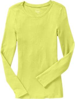
My opinion on the yellow tops...the solid tee looks beautifully sunny and warm. There is a range of yellow that looks great on both FIRE and EARTH and I think that particular yellow belongs in that category. From my end, I think that yellow would blend in with your brights and blend in with my muted colors. I would call it a borderline color based on what I can see.
The sheer blouse is a different yellow. More true to yellow and less toward orange-y. The sheer material is kind of acting like sweater knit for me. The texture makes perceiving the clear/muted more difficult. At least, this happens for me... In the group photo, it harmonizes really well with the other yellow, blue and brown, so I'm definitely thinking that it's a keeper. Harmony is the key. I think that blouse would be a great accent piece for a fire.
Pants for FIRE are seriously an issue. SERIOUSLY. Shopping with Mom can be an exercise in frustration...the tans can definitely be too "pink" and not "yellowy" enough to go with the warm brights...the khaki's can be the same way...finding the right milk chocolate brown is like impossible...the warm, clear gray is also impossible...if you can find cream colored instead of white, that's amazing...but then who wants such light colors for their bum all the time?
If you like solid tops, then finding complementary prints in skirts and dresses really does become easier.
Otherwise, you just have to deal with finding pants that are more EARTH like...and deciding that you LIKE the way that looks...finding the darker brown, the neutral greens (army, olive, etc.)...and put those with some of your complementary brights...FIRE really needs to learn how to bend the rules until you can get those key pieces...
If you take a look at these two posts by Curt
http://boards.cruisecritic.com/showpost.php?p=23736418&postcount=2624
http://boards.cruisecritic.com/showpost.php?p=23736427&postcount=2625
then you can see what his neutrals look like...Camel is definitely one of the colors this season. Curt has a camel suit that looks great with the fire colors. I know that you are a bargain shopper Joby, but I would recommend that you scope out some great camel colored pants and perhaps watch for a great sale or just bite the bullet...get something that is the best quality you can afford for longevity and consider it a part of your capsule wardrobe...
-
Wow ladies!!! Joby, you have been having so much fun shopping...I'm totally jealous, I have to say...I'm in the process of some major weightloss, and I lost a chunk and went shopping and I'm still not a size that I want to buy and so I have had NO FUN at ALL shopping!!:eek:
But you have!!
The funny thing about that first blue picture...with the Old Navy shirt on top and the two other new ones below... you can see the differences in the blues, and yes, one or the other looks "cooler" because they are more blue and some have more of that green color that makes it look warmer...so you wonder on this end of the internet, is one cooler than the other? And then you put the cards up and it's like, NOPE, they really do harmonize. When you look at the picture, they don't "fight" even if one looks cooler than the other...and I think that is the key to remember...
We all interpret color in relation to another color...so ALL color will look warmer or cooler than another color even if the cooler color is still WARM...and that's the cool thing about the control of the color cards. I think the blues are all a hit...however, I think that the final verdict will be decided when you look at pictures of yourself.
I know that I have bought some seriously cool looking purples and blues for my Mom, who is a fire, BUT they are actually warm and she looks awesome in them. So the pictures of yourself tell the true story.
On the jacket...on my monitor, the jacket itself is not lavender, more pink, but it is definitely reading cool, BUT the fur part is definitely reading a kind of tan color that is warm by comparison. I have to say thought that if that is working well enough with all your lovely FIRE colors to do as Terri says, cooperate with your fire colors, then the tan of this jacket is workable.
Great job Joby!:)
-
Knowing return policies is always the KEY to online shopping anyway... you just may have a new reason for return beyond the actual fit of the garment.
-
how do I tell if it's a dark FIRE periwinkle or an ICE royal blue/purple? (Without having to buy the item first and do a test photo!
Well now...that is the trick isn't it?
There are a couple of different things that you can do...
The first is to have a control that you keep with you when you are shopping. This is where you hear the talk of many of us that use Curt's color cards, or some other color swatch system from another supplier. Lighting can have such an effect on the way we perceive color. Ever buy something in the store that you think is one color, then you get it into the sunlight and you're like, what? This is the beauty of carrying a control. Regardless of what the colors end up looking like in the lighting of the store, you KNOW that the control colors are good. You use your control colors to make comparisons.
Another methodology along the same lines is to eventually use the clothing that you are wearing. Be sure that you wear great colors for you and then you can walk around seeing your beautiful self in the mirror with your fabulous elemental color on. Now hold up a questionable color to yourself in the mirror and compare what happens to what you look like in your own shirt. Do you look as good in the store shirt?
Do the same thing with your phone camera... take a picture of yourself in your current shirt with the current lighting conditions in the store... take a picture of yourself trying on your shirt in the same lighting conditions and compare the photos...
Start making a color party in the store. Use the clothes you are wearing...take them all off in the dressing room if necessary... Grab other KNOWN colors in the store... go into the dressing room and make a collage (kind of like I did on my shower door) and see if the color "goes" with your collage...
Try to accessorize the questionable item... My mom and I like this one especially for formal dresses... We like Gianni Bini at Dillards... I'll take that royal blue dress all over Dillards... down to the shoe department, grab gold, bronze, silver, pewter, black, brown, cream, whatever colored shoes to see what "goes" best with the dress... over to jewelry, handbags, etc... if the cool colored accessories are looking better...then it's a cool colored blue.. if the warm, golden accessories are looking better...then it's a warm colored blue...
It's really hard to wrap your mind around blue and purple being HOT colors. I volunteered in my son's art class. And the teacher was teaching that yellow, orange and red are the warm colors on the color wheel. Green, blue and purple were the cool colors. No if, ands, or buts about it.
I've found, on my screen anyway, a very cold, ICE royal purple kind of color for you to compare with that purple in Curt's photo...

Can you see in the "color party" that IF the color of the dress were the color of the shirt, it would be "doing it's own thing"? It just doesn't "go" at all. The fact that the purple on it's own may SEEM like it SHOULD be an ice color to you, but you can see how it GOES...you have to start trusting in your eye's ability to see the harmony and blending of colors...
-
Hi Pam,
I think we would LOVE to shop together too, don't you? It's wonderful that you and Anita have such a good relationship and have such fun shopping together.
Kim... Mom and I have a great time shopping together... It's fun to have Dad along too... between the three of us, we have FIRE, EARTH, and ICE covered... If the color doesn't look good on any of us, we say it's for Bonnie or QMadam! LOL...
It's just too bad that Mom and I are so far away that the shopping trips are only about once a year...boo hoo.:(
-
Anita: Loved the purples you posted. I think I'm finding it easier to identify fire purples than fire blues. Many of the right shades are what I personally think of as "bright plum" or "bright violet" as opposed to true purple (which in my head translates as bluish/cool). I think we all probably have different ideas of what different color-words represent, but I think that for all of us, once we see a good example, it helps to think of them in terms of our own color vocabulary. (Another example: "light warm gray" means nothing to me; but "yellowish gray" is a way to think of it that I completely understand.)
When it comes to the blues, however, I'm still utterly lost.
Here is a picture Curt posted a long time ago. He had found all these FIRE shirts at Express for a rockin' deal. IIRC, he even bought multiples of these shirts for when they would wear out... His philosophy is to get it when you find it...especially in "the basics".
I'm reposting this photo because the Season thread is so long, and you might have missed this post. Anyway... the blue in this photo totally "goes" with the other colors...notice that not one looks out of place or sticks out like it's "doing it's own thing." If you try to get too analytical with it, you might look at the blue and think because it is really BLUE and not aqua-ish that it looks cool... if you try to pick out the blue alone and analyze it... so don't do that LOL... this is the help of clustering and making color parties...
This confuses me, because periwinkle is supposed to be a fire color, and periwinkle is nothing but slightly purplish blue. Is it that purplish tones are okay in lighter blues but not darker ones? I don't get it..."Periwinkle" is in every palatte...A while back, I tried to find the periwinkles for some of the different palattes...here is the post that I did...
http://boards.cruisecritic.com/showpost.php?p=24145490&postcount=2885
Here will be a very confusing statement... FIRE periwinkle is more of a purple color with a blue undertone, but the blue undertone is a "warm blue" ROFL
And I have one more question. Can hot pink ever be a fire color? I have this super-bright pink cowlneck top, and I think of hot pink as a "cool" color, but this one really seems to be warm - it's not coral, and yet the undertone seems decidedly orange/yellow and not at all blue. It's sort of like if you took Curt's "clear bright warm pink" and made it a lot brighter and darker. I guess I'm answering my own question, but I really didn't think that hot pink could be warm (without crossing the line into coral).Thanks for the patience, everyone!
Mom and I have been in debates over whether or not "pink" can ever be a FIRE color. Because typically, that tone of color needs to have more of that orange in it. BUT when I think of pink... I KNOW that there are blue-pinks and more yellow-pinks, you know?
Now I remember the old school names of color in the big 64 box... and there was a color called "salmon" which was like a warm pink. It was more muted though... And I took my Mom's sweater that I could call salmon (it was muted, she shouldn't really wear it anymore...(tee hee))... and it looks great on me, even though it is more "pink" than coral...
My answer about "hot pink" is MAYBE, ...
Pink as a color is mixed in art by adding white paint to red paint... so if you add white to an orangy-red then you end up with a more coral-ly kind of version of "pink"... whereas if you start with a more blue-red and mix white, you get that blue pink. So, for all those reds in the middle what kind of pink results? Where does the line cross between the pinks as it does for the reds? And are any of the "warm pinks" NOT coral colored? Do these questions make sense to you?
These dresses are all labeled "hot pink". So the one on the far left is totally ICE. I hope you can see that on your monitor. And as the dresses go from left to right, they get more "warm" because they go further from the blue end of the spectrum, but the question is... do they ever get far enough away to be consider a "warm color"? The only way to truly answer this question is to put it on and see if it works on you. If you have a control picture of yourself (which you do now)... then you put on the questionable garment in the same "test" conditions... from comparing the two photos, you will see if the color is YOUR color or not...
Post a pic of you in that sweater on the Season thread and we will all chime in with our opinions... it's the next phase that happens after figuring out your palatte... now you go through your closet to see how much stuff you have that is IN your palatte!
Does that help? LOL.
-
I do have a question on the bright yellow. It appears to me here at home that it's a very pale bright green, not a yellow. Are there pale bright greens in the Fire palette? Or, is it just the Granny Smith apple green?
Am I driving everyone nuts with all of the questions????
The crazy thing about color is that technically, there could be a version of every single color that would be appropriate for every palette...
So if we want to talk about "pale green" (which just doesn't work AT ALL in concept when thinking about FIRE, but I understand that you are meaning a lighter color of green, or a green that is less saturated...), it exists, so long as it is warm and clear...
I can't help myself... I shop for my Mom whenever I shop for myself. Just because it can be so hard to find the right colors. A FIRE GREEN other than granny apple green is really hard to find. This particular color, called "plaintain", which is the name of a fruit related to bananas, which are generally yellow, is reading as a yellow color on my monitor, with a green undertone.
You would have to take a picture of this one, because as I said before, both my Mom and the other fire lady that wore greenish looking yellows were told they were wearing the wrong yellow... But the camera will not lie. I know you saw the recent pictures on the Season thread... the Fire lady is wearing that cold bright blue and it wrecked havoc on her skin tone... when in doubt... take a picture... know your store's return policy, or take a digital camera with you, or use your phone if applicable... take a picture of yourself in a known color in the store and compare that with a picture with the questionable color. The lighting will be consistent in the pictures so you can do a fair comparison on what happens to how you look with the two colors. If the questionable color makes you look the same in the photo as the known color, then it's a good color. If the camera tries to do some sort of weird compensation and the picture looks wacked, then it's a bad color...
You really need your pale green to read more like this does on my monitor...
The left on the left for the last picture. In a way, you could call all these colors a version of granny apple green... I think that the point is though, that if you are looking for a pale green, it needs to read like green with a yellow undertone and NOT yellow with a green undertone, which sounds ridiculous even as I type, but seems to be the truth...
I have found this to be true in general...
like blue... if it is a BLUE color and leaning toward the violet end of the spectrum, it looks cooler than if it approaches the green end of the spectrum...
green... if it is GREEN will look cooler the more it leans toward the blue end of the spectrum and warmer toward the yellow end...
yellow... if it is YELLOW will look cooler toward the green end of the spectrum and warmer toward the RED end...with most oranges being warm...
red... if it is RED will look cooler toward the blue/violet end of the spectrum and warmer toward the yellow/orange
violet... if it is VIOLET will look cooler toward the blue end of the spectrum and warmer toward the red...
Do you remember the blue-green crayons versus the green-blue crayons? red-violet versus violet-red? They were totally different colors with one being more warm or cool than the other. This is relating to the undertone of the color itself. If you remember seeing my post on green on the seasons thread, I made a collage out of all my different greens. When they were all together, they no longer looked green, they looked yellow, blue, gray... you look at the picture and you'd have a hard time saying, look at that green shirt... you HAVE to start differentiating the green... olive green, forest green, army green, avocado green, yellow green, gray green...etc.
Ever try to pick out a "tan" colored paint? You get all those paint chips home and they look pink, yellow, reddish, whatever... they certainly don't look "tan" any longer...
But this is the point of your skin as well... you are "flesh colored"... we all are... but you have a "warm undertone"... so you need to find the colors that have that "warm undertone" to match your skin... every color will work, so long as you find one with the same undertone you are.
The added element to that equation is the clear v. muted colors. Because of your skin type, you also need clear colors and that is what differentiates your warm undertoned skin from an earth person's skin. Wow. I talk a lot. I HTH!! I think this is all very interesting so I like to talk about it...please forgive me if I talk too much...
-
Old Navy online seems to have colors that look the same but, have different names. Kind of confusing to a newbir "Fire" gal who's looking for "for sure" matches :)
I was curious when I looked online at Old Navy for the exact color names of the tees I got, so I put in the style numbers and this is what I found:
This is MUCH brighter in person: http://oldnavy.gap.com/browse/product.do?pid=771952022&userSearchText=771952022&searchCID=26519&vid=1 Online this looks like a perfect Earth color :D IF it is brighter IRL, then it's fire. Remember that color is a spectrum, and somewhere along the line, there is that changeover from muted to bright. There are "borderline" colors as you approach that crossing line... If this is one of those borderline colors, then it probably looks brighter when paired with your tried and true fire colors, but it probably could look less bright if I were to pair it with my earthy colors. There is nothing wrong with having items like this... one of the keys to understanding the whole color scheming is to understand HOW and WHEN you can bend the rules. This might be one of those type of items.
the green is called "clean green": http://oldnavy.gap.com/browse/product.do?pid=771878002&userSearchText=771878002&searchCID=26519&vid=1 I think this might be too cool for fire. I look at it and think it looks a bit frosty not firy... it's a bit blue... if IRL it has that granny apple green look? then it's a good fire green, BUT if it DOES have that blue undertone that I see online...then it is ice.
the blue is called "bluest eye": http://oldnavy.gap.com/browse/product.do?pid=771878002&userSearchText=771878002&searchCID=26519&vid=1 Already discussed...
the aqua is called "aquatic park": http://oldnavy.gap.com/browse/product.do?pid=771874142&userSearchText=771874142&searchCID=26519 This COULD be fire. If you look at IRL and think of the Carribean? Then it's fire. If it makes you think of walking on a glacier? or sherbet? Then it's ice.
the pale green is called "plantain" : http://oldnavy.gap.com/browse/product.do?searchCID=26519&vid=1&pid=771872&scid=771872302 This is NOT fire. It's hard to think that about yellow, but this yellow has a very green undertone to it, not the sunny kind of yellow that you need as a FIRE. Back on the season thread, Member123 and another FIRE were wearing a similar yellow and Curt explained more about yellow there...hmmm I think somewhere in the 60s pages?
I'm becoming obsessed I think, is this normal? :eek:
Like Member123 said...obsession is completely normal... I think that we all go through the phases of obsessing over all the color information, especially in the beginning when we all want to completely redo our wardrobes and want to train our eyes. I think that once you feel like you "get it", it isn't so much of an obsession (taking up so much of your time) as it is just a tool that you use regularly. If that makes sense.
I made comments on the way I see the colors above... Since Terri was actually in the store, her comments would probably be more relevant...
-
Terry...I remember for sure that the far left dress is Gianni Bini. I got them all off the Dillards web site.
Joby...The blues are really really similar. It's just a slight variation between the dresses with no black and the dresses with black. There is so much that can affect the color from the photography, lighting, the camera settings, our monitors, etc. On my monitor, the dresses with black have a very slight purple-ish tinge to them, which is the give-a-way for the ICE version of royal blue. So I was calling the no black dresses FIRE and the black dresses ICE. IRL this could be a totally different story...and please keep in mind all these differences when you look at the photos...what you see could be different than what I see...
One thing to keep in mind with all this talk about color... technically speaking, there can be a clear, muted, warm, cool version of every color. We interpret whether a color is considered clear or muted, warm or cool, largely by comparison. You can usually find something that is "more warm" or "more cool". I have some bluish greens that can look "cooler" than my yellow greens. Then I can find a cooler blue-green and my blue-green will look "warmer".
The keys then to identifying whether or not your color is right for you are two-fold... First, you have to really get to know what you look like when you are wearing a complementary color... know what happens to your skin tone... what happens to how your eyes pop... Second, seek to blend a questionable color in with identified colors. This is the help of the color cards... You don't try to actually match the color perfectly, so much as you attempt to see if the questionable color blends into your color party...
In additional to using the cards... You can do this concept at home with the cards and with winners from your closet. Make a color party on your bed... You can do this by grabbing colors that you are confident in identifying and making a color party at the store... grab appropriate neutrals and accessories... this season, you should be able to find camel, cream, any warm brown (not too dark), grab brown shoes, gold shoes, bronze shoes, the same in jewelry, scarves, whatever... does the item GO? If you need to, you can do the same for ice, grab black, white, silver and see if the color goes better over there...
Stores that carry "FIRE" season clothing
in Cruise Fashions & Beauty
Posted
I second! Glad to read you had a great time...and do you have any pictures?
My parents had to get off the ship today by 11PM. I think they have a day in FL before flying home. Hopefully, Mom can post some photos too!